Data
visualisation
Charts and dashboards that tell a clear story: what changed, why it matters, and what to do next.
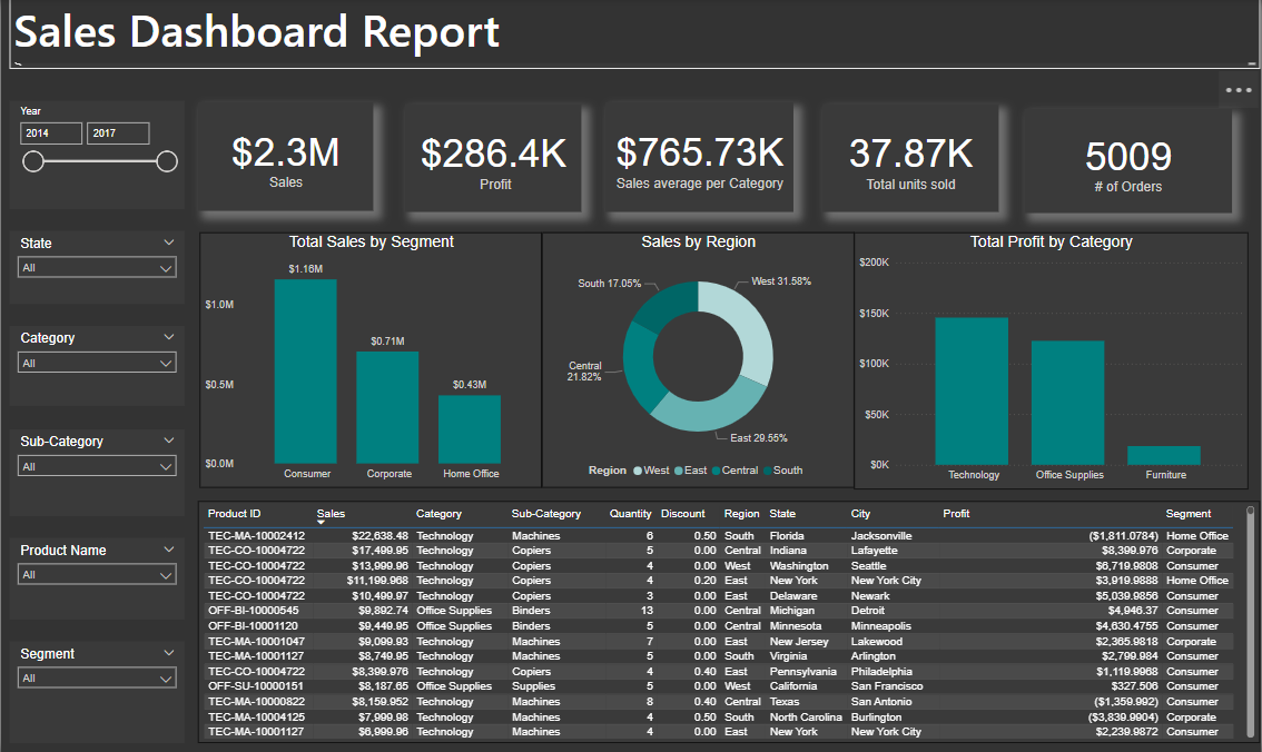
Dashboards and charts that tell a clear story: what changed, why it matters, and what to do next. The pieces below use Power BI, Tableau, and visual reporting built for a business audience.
Power BI sales dashboard
A visual summary of key sales metrics such as total revenue, sales growth, and top-performing products. It highlights trends, compares performance against targets, and flags opportunities or areas that need attention.
Tableau sales dashboard
A Tableau view of business performance — designed so a stakeholder can see what changed, where, and what to ask next without digging through raw files.
AI job insights dashboard
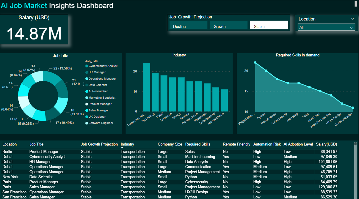
A dashboard of the current AI job market: industries, roles, skill requirements, and salary insights. Built to make a noisy market readable for someone deciding where to focus.